

|
| Index & Notes |
|
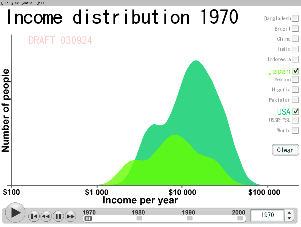
Income Distribution, US & Japan, 1970
The problem, of course, was because of income distribution, graphed for many countries at a fine website called gapminder.org, which has brought to life Professor Sala-i-Martin's estimates. The income of the individual is along the X-axis, a log scale; the number of people at that yearly income, all in constant year 2000 dollars, is on the Y-axis. The two countries compared are the US, with more people and in darker green behind, and Japan lighter green, in front.
© Roy Brander, P.Eng 2008